Over the past couple of months I’ve been working with the very talented Hannah Hubbleday on the look and feel of The Cantin Patch brand. First impressions count, so I wanted to make sure that even at this early stage, my little upholstery business looks the part and continues to look that part as it grows.
Hannah, a designer with a great deal of experience has recently set up her own business, so it felt like an even better fit that we should work together and support each other at this exciting time.
I had a few things on my wish list:
1. My brand should have a slightly masculine edge – it’s very easy to go all ‘Kath Kidston’ when you think about craft and fabrics and that’s not really my style
2. My brand should reflect my Black Country location – after all, my brand name is derived from a Black Country word
3. I love shields and emblems – I just do.
And so with a good grasp of my likes and dislikes, Hannah set to work on phase 1 – my logo. She skilfully created a number of logos for me to consider and I have to say that I had underestimated how tough the decisions would be! This was something that I could be living with for a very long time, so it needs to be right.
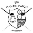
Anyway, over a period of a few weeks I consulted some of my most trusted friends and I lived with the logos for a little while to see how they felt. There was however a clear winner (I think I knew this from the moment I saw it) and here it is…..
What Hannah has done for me here is successfully tick all the items on my wish list and then some! My new logo feels masculine, but still represents my craft through the simple, monochrome buttons and the crossed needles. Hannah has taken the pear from the Stourbridge coat of arms and added it to my own shield as a really lovely ‘nod’ to my Black Country roots. The geometric pattern in the bottom right was inspired by one of my early pieces, the large peacock-footstool. I love how the whole thing looks traditional and modern at the same time.
So with the logo agreed, it was time to start applying it to things; letterheads, cards and social media to name just a few.
One of the things we considered with the logo was whether it needed some colour and we talked quite a bit about how that might look. In the end we agreed that the monochrome logo would enable me to work with a variety of patterns and textures that could sit behind the logo, adjusting the look and feel very slightly with the logo itself providing the consistency. My new business cards show how this works and Hannah has used the same principle to make my letterheads, invoices, stickers and even postcards!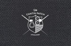


One of the other things that I really like it being able to take just one of the elements from the shield, in this case the pear, and use it to reinforce the brand without having to use the whole logo
Today we’ve applied the new brand to my Twitter and Pinterest accounts, and you’ll also find it on my newly created Facebook page . I’m just so excited to see my little business start to look so professional with an identity all of its own. I feel dead proper. I hope you like it as much as I do.